
Colour Consultation in Toronto — Decided in the Room, Not the Showroom
A colour is not a property of paint. It is what happens when your light hits it, and your light is not the showroom's light.
No charge
And no deposit taken on the day
Real 2K
Samples in the finish, not printed card
Left with you
For a few days on anything uncertain
5.0
Rated on Google
Why the room decides and the showroom cannot
Colour is not something a surface has. It is what is left of a light source after a surface has absorbed part of it, which means the light source is half the equation and it is the half nobody controls.
A showroom is lit deliberately: high-output LED at a flattering colour temperature, from several directions, usually with no daylight at all. Every sample in it is seen under the same conditions, so they can be compared with each other — and that comparison tells you almost nothing about what any of them does in your house.
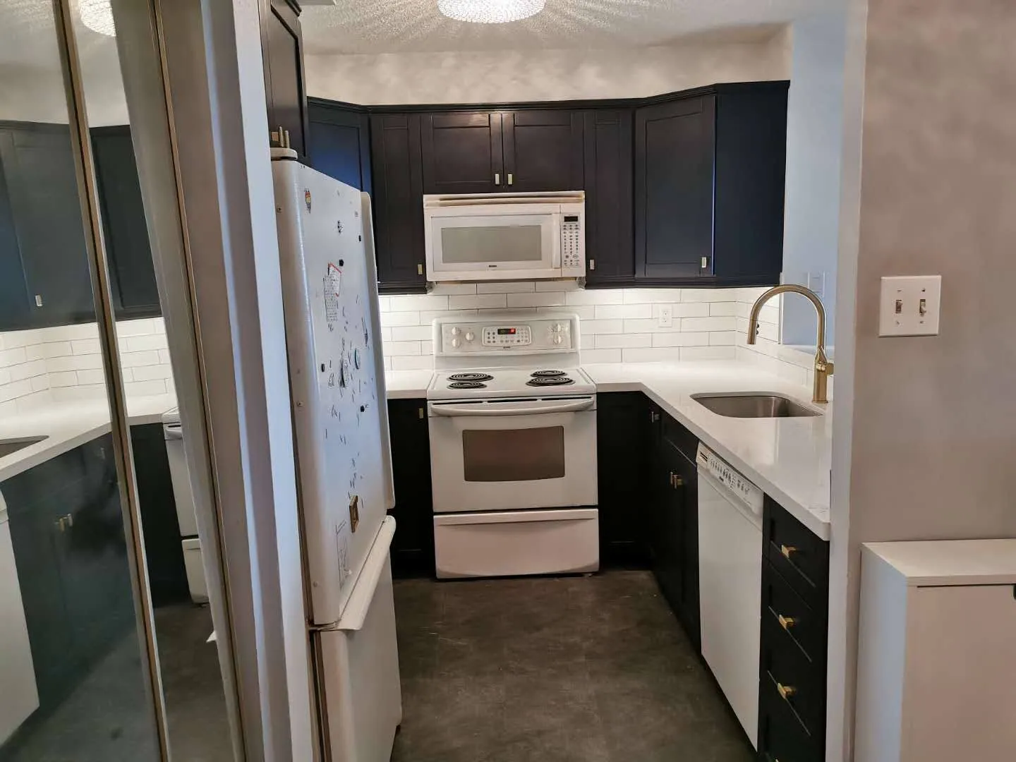
Your kitchen has one or two windows facing one direction. It has a ceiling fitting chosen by whoever lived there before. It very often has under-cabinet lighting at a completely different colour temperature from the ceiling, which means the doors and the countertop are lit by two different lights.
Take a warm off-white chosen under showroom light into a north-facing Toronto kitchen and it reads yellow. Not subtly — visibly, permanently, in a way nobody can unsee once it has been pointed out. Take a cool grey into a west-facing room and for an hour every afternoon it turns faintly lilac.
The samples have to come to the room. There is no substitute and there is no shortcut.
North, south, east, west
Orientation is the single most predictive thing about how a colour will behave, and it is knowable before anyone visits.
North-facing rooms get no direct sun and their light is cool and consistent all day. Cool colours go colder and can read grey and lifeless; warm colours are generally the safer choice, but a warm white with a strong yellow base will look distinctly creamy. Most of the "why does my white look dirty" conversations we have are north-facing kitchens.
South-facing rooms get warm direct light for much of the day. They can carry cooler colours easily and are the most forgiving orientation. The risk here is the opposite one — a warm colour can go hot, and a strong colour will be brighter than it looked on the chip.
East-facing rooms are warm and bright in the morning and cool and flat from midday. Anything chosen there needs to be looked at twice, at both ends of the day.
West-facing rooms are the reverse and are the most dramatic. Flat morning light and a long, very warm evening, which is when most people are actually in their kitchen — so a west kitchen is often best judged at six in the evening rather than at eleven in the morning.
We ask which way the window faces before the visit and bring samples chosen for it.
Undertone, which is what people are actually reacting to
When somebody says a white "looks wrong" and cannot say why, it is nearly always undertone.
There is no such thing as a neutral white in practice. Every one is mixed with a base that pulls it somewhere — yellow, red, blue, green or grey. On a small chip under shop light that base is invisible. Across thirty cabinet doors in one room it is the dominant fact about the kitchen.
The test that works is comparison. A white on its own looks white. Put three whites side by side on your own counter and the undertones separate immediately: one is clearly creamy, one clearly cool, one somewhere between. That comparison takes about ten seconds and it is more informative than an hour of description.
Undertone also has to agree with everything staying in the room. A cool white against a warm oak floor fights it. A creamy white against a grey quartz countertop reads dingy. This is the most common reason a colour that is genuinely lovely turns out to be wrong in a particular kitchen — it is not wrong, it is arguing with the floor.
So the samples get held against the floor, the countertop, the backsplash and the adjacent wall, not looked at in isolation.
What sheen does, and why it is chosen last
Sheen changes a colour's appearance nearly as much as the pigment does, and it is usually decided in about four seconds at the end of a conversation.
A higher sheen reflects more light directly back, which lightens the apparent colour and adds a highlight along every profile edge. It also reports every imperfection in the substrate underneath, every fingerprint, and every wipe mark. On a shaker door it emphasises the shadow line at the panel, which some people love and some find busy.
A lower sheen absorbs more and reads deeper and softer. It hides substrate flaws and fingerprints, and on dark colours it is almost always the better choice — a gloss black cabinet is a maintenance commitment nobody warns people about.
Most of our kitchens go to a satin, which is a genuine middle rather than a compromise: hard-wearing, cleanable, and it lets the door profile read without turning every surface into a mirror.
We bring samples in more than one sheen of the colour anyone is close to choosing, because describing the difference does not work and seeing it takes a moment.
Hardware, which is part of the colour decision
Handles and knobs are chosen at the same visit, and putting them off is a mistake.
Metal has a temperature the same way paint does. Brushed brass is warm and pulls a white towards cream. Matt black is neutral and graphic and makes a warm white look warmer by contrast. Polished chrome is cool and can make a creamy white look yellow. Nickel sits between and is the most forgiving.
The other thing handles do is set the age of a kitchen. A cup pull and a knob read traditional. A long bar pull reads contemporary. The same door in the same colour with those two options produces rooms that people describe completely differently.
They also have to answer to what is already in the room and not being changed — the tap, the appliance handles, the light fittings. Three metals in one small kitchen is one too many, and it is easier to see that with the actual pieces on the counter than to reason about it.
The cheapest step in a spray project and the one that prevents regret
Choosing the colour costs nothing and it decides how you feel about a kitchen for a decade. It also interacts with the finish itself — sheen, film build and the non-yellowing chemistry all change how a colour reads once sprayed, which is why samples are made in the real product. Reading what the finish does to a colour once it is on the door covers what the coating contributes before the colour is even chosen.
What a Colour Consultation Costs in Toronto
Nothing, and no deposit is taken on the day.
The reason that is possible is the order things happen in here. Photographs first, then a written itemised price inside 24 to 48 hours, and that price does not move. By the time anybody is standing in your kitchen with a sample case, the commercial part is finished.
Which changes what the visit is. Nobody is working towards a signature, so there is no reason to hurry a decision, no reason to steer you towards the more expensive option, and no awkwardness in saying you want a week to think. Samples get left behind on anything uncertain, and a second visit costs nothing either.
Where a colour choice genuinely changes the price — a premium or custom-matched colour, a change of door profile mid-conversation, upgraded hardware — it appears as its own line on a revised written quote rather than being agreed verbally at your counter.
Cash, debit, credit and Visa when the work starts, and nothing before that.
Questions
Common questions about choosing a colour
- Is there a charge for this?
- No, and no deposit is taken on the day either. It is possible because the written price was already produced from your photographs, so nobody is using the visit to close a sale. A colour visit that ends with a contract in front of you is a sales call with a sample case.
- Can you just tell me what is popular?
- We can, and it is close to the least useful thing we could do. What is popular right now will be legible as this year for the next fifteen. A kitchen should answer to the house it is in, and a colour chosen from a trend list in a house it does not suit is the most common way a good budget produces an off room.
- What do you actually bring?
- Door samples in the real profile and the real 2K finish, colour chips, hardware in the actual metals, and a few samples of whatever is adjacent — countertop offcuts, floor pieces. Not a printed brochure. A photograph of a colour is not a colour and a printed chip is not a sprayed surface.
- How long should I take to decide?
- Longer than one visit, on anything you are unsure about. We leave samples behind and ask you to look at them at three points — morning, mid-afternoon and with the lights on at night. The colour that survives all three is the colour to choose.
- Can you match to something I already have?
- Yes, from a physical sample rather than a name or a photograph. A floor board, a tile, a piece of the countertop, a fabric. Colour matching from a screen image is not possible in any reliable way, whatever an app claims — a screen emits light and a kitchen door reflects it.
Stuck between three whites that all look the same?
They will not look the same in your kitchen, which is the point. Send the photographs, get the fixed written price first, and the samples come to you with nothing riding on the visit.
Free in-home consultation · no obligation
Refaced. Repainted. Refinished.